Tomi Leppänen (b. 1976 in Siilinjärvi) is a musician and a designer specializing in visual identities, actively engaged in the fields of design and the performing arts.
Leppänen’s creative processes resemble each other in music and design: both are results of free intuition, experiments, and rhythmic thinking. In Tauko Paus Pause, Leppänen approaches design through the methods of conceptual art. The works created for this exhibition contemplate the significance of a pause in visual communication design as well as music, guiding the visitors through the language of signs, symbols, and basic forms.
The light installations and kinetic, motion-based works measure time, keep the viewer waiting and encourage them to pause. As reflections of the designer’s mindscape, the works are filled with light, minimalism, and thoughtfulness. The exhibition is created in collaboration with the exhibition designer Hanna Anonen.
Previously in his career, Leppänen has released his works in small series, launched a rug collection for the sustainable design company Mum’s, and created visual identities for several companies and festivals. One of his most famous works is the Varför Paris, vi har ju Åbo print, designed for Turku Design Festival.
1. DOT
Dot (2023) features two dots of different shapes. The dot, the simplest element used in design, is also a typographical symbol that indicates the end of a sentence. In typography, a dot – or full stop – is generally a square or round form, depending on the font. The true form can be seen by increasing the font size. This work features the full stops of two commonly used fonts, Helvetica (left) and Times New Roman (right).
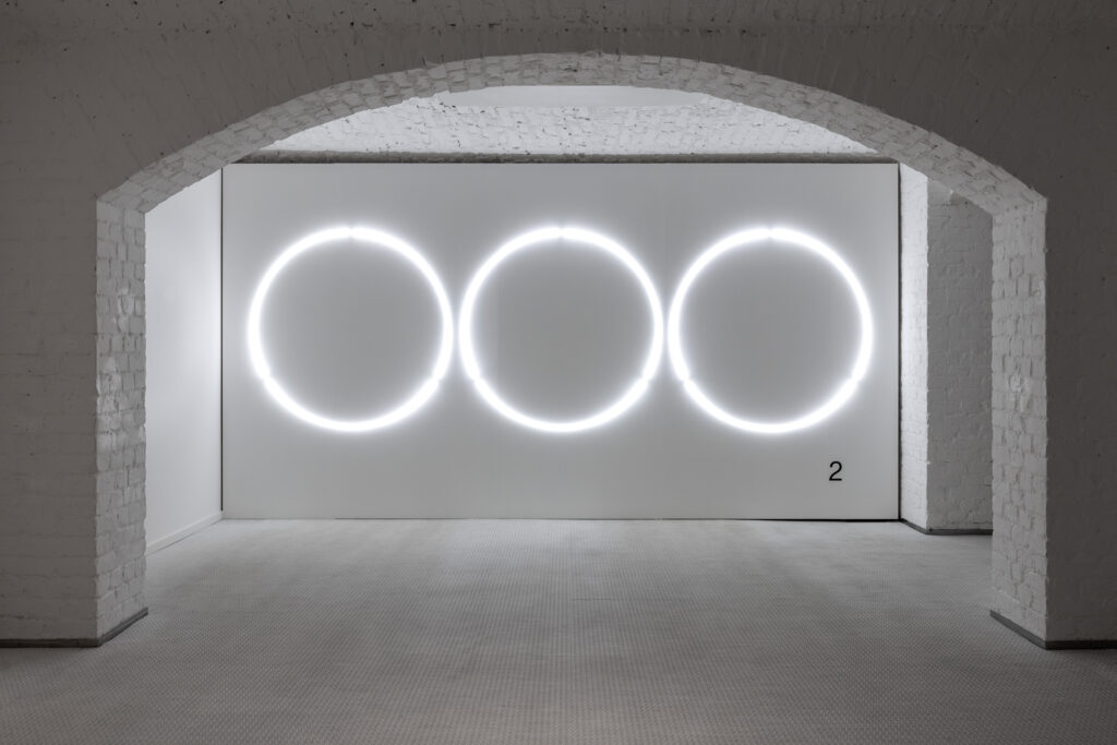
2. DOT DOT DOT
In Dot Dot Dot (2023), three round-shaped dots composed of neon tubes turn on and off, creating the visual image of a string of advancing characters. In written text, a row of three dots – an ellipsis – is often used to indicate an incomplete thought, an unpleasant pause, or similar. In instant messaging applications, blinking dots indicate an incoming message. The constant motion of this work reflects the tension and anticipation of the ensuing pause.
3. A DOT IS A LINE THAT CAME BACK FROM A WALK (2023)
This work is composed of two vertical, programmable LED screens. On the first screen, a dot moves to form a line. On the second screen, a line moves to form a dot. The line can be seen as a byproduct of the dot: it is formed by the movement of a static dot. Artist Paul Klee (1879–1940) once said, “A line is a dot that went for a walk.” This work replies with the notion, “A dot is a line that came back from a walk.”
4. COLON
In this work, a programmable LED screen features a blinking colon: two dots positioned one on top of the other. Digital clocks use a colon to indicate seconds in line with information system standards. Originally, the colon blinked once a second for power-saving reasons, appearing for half a second then disappearing for another half second. In Colon (2023), the loop formed by the colon is one second long, and is timeless at the same time, since there are no numbers to indicate the time.
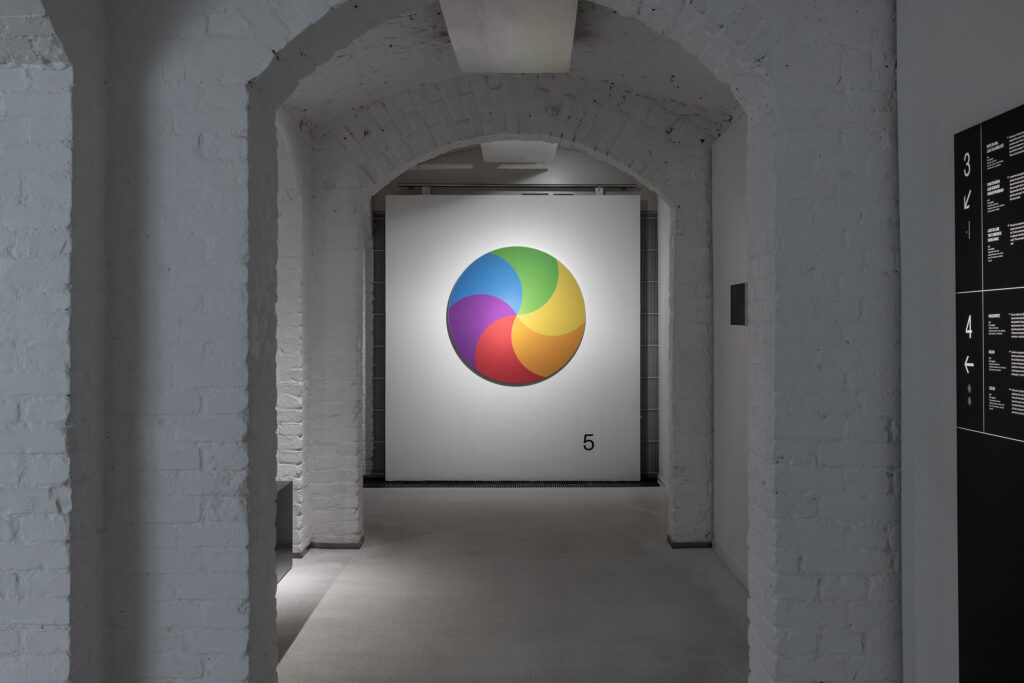
5. BEACH BALL
‘Beach ball’ is the name given by Mac users to the spinning wait cursor that appears when the programme is unable to perform the task required of it. When the colourful cursor appears on the screen, the computer freezes, sometimes crashing completely. In Beach Ball (2023), a round symbol that resembles a hypnosis wheel starts to slowly spin in response to the viewer’s approach.
6. PROGRESS BAR
The progress bar is a symbol used in computer operating systems to visualise the time required to carry out the function being performed; data transfer, for instance. It has been shown that a progress bar decreases the stress induced by waiting and helps to promote a more positive user experience. In Progress Bar (2023), the gradual forward movement of the bar is triggered by the viewer’s approach and visualises the progress of the work’s own performance.
7. LOADING CIRCLE
A loading circle is an animated icon on the screen of a computer or smartphone. The spinning of the loading circle indicates that the software is performing a task in the background; when a download is in process, for instance. In Loading Circle (2023), twelve neon tubes are positioned to resemble a clock face. The clock hands turn off one by one in sequence, creating a slow, circular motion. Within the exhibition space, Loading Circle offers the viewer an opportunity to recharge themselves as they wait for the task – whatever it may be – to be completed.
8. DOTTED LINE (2023)
A dotted line is formed by neon tubes hanging from the ceiling in this work. A dotted line, consisting of a string of short dashes and the spaces in between, provides an opportunity to visualise things that are not there. A form drawn with a dotted line can symbolise a temporary or concealed element, while a dotted line between two elements can refer to an invisible connection. When positioned in the exhibition space, the dotted line is an object that comments on itself, symbolising its own temporary nature by appearing in the space only momentarily.
9. NOTHING
This work consists of a transparent acrylic box with a pair of brackets positioned inside it. Brackets – or parentheses – are characters placed around words or numbers to indicate a separate piece of information of less critical nature. In Nothing (2023), however, the parentheses make the empty space between the characters visible. The starting point for this work is a quote from avant-garde composer John Cage (1912–1992): “I have nothing to say / and I am saying it.”
10. LINE
In Line (2023), moving dots of LED lights form a line on a programmable LED screen, exploring the difference between a line that is drawn as opposed to one that is written. Does the moving image appear as an image of a line, or as a single typographic character such as a dash? This work is based on a quote by conceptual artist Sol LeWitt (1928–2007): “A drawing of a person is not a real person, but a drawing of a line is a real line.”
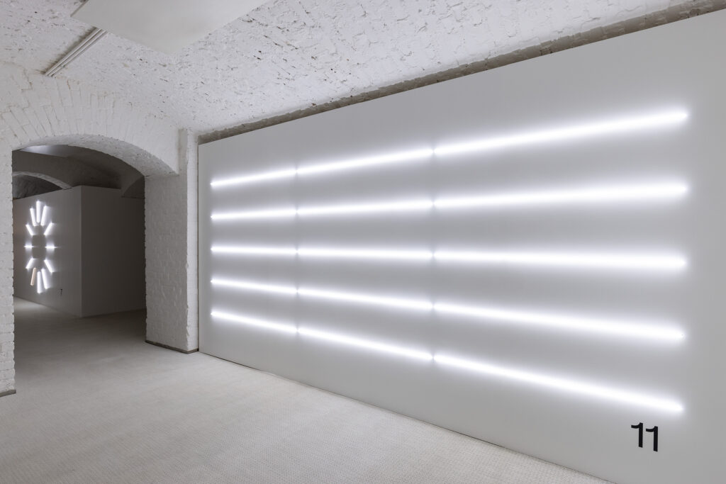
11. 4m 33cm
In 4m 33cm (2023), neon tubes are positioned vertically to form a stave. In musical notation, symbols representing notes are marked in different positions on the five horizontal lines and four spaces of the stave to indicate the pitch and duration of each note. 4’33” is a 1965 composition by American avant-garde composer John Cage (1912-1992), with no musical notes indicated on the stave; the composition consists of 4 minutes and 33 seconds of silence. Here, the stave composed of neon tubes is a 4 metre, 33 centimetre-long silent tribute to Cage’s work.


